
Gray in the desert…
Suddenly (in the past few years, actually) we all seem to find we love gray. Here in Arizona, beige/brown used to be our go-to neutrals. (We don’t even use natural gray concrete here for our community sidewalks, which have always been beige colored concrete!) But even here, where the dirt, rocks and mountains are all shades of brown, we are loving grays, taupes, and greiges (gray-beiges). The freshness of the cooler gray tones are a nice break from all the heavy brown that’s been the go-to desert neutral for years! It also compliments the (relatively) new design direction that is charging ahead rapidly toward cleaner, more open and contemporary spaces.
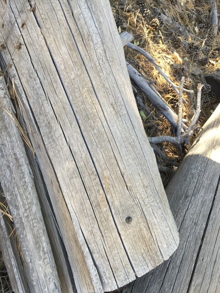
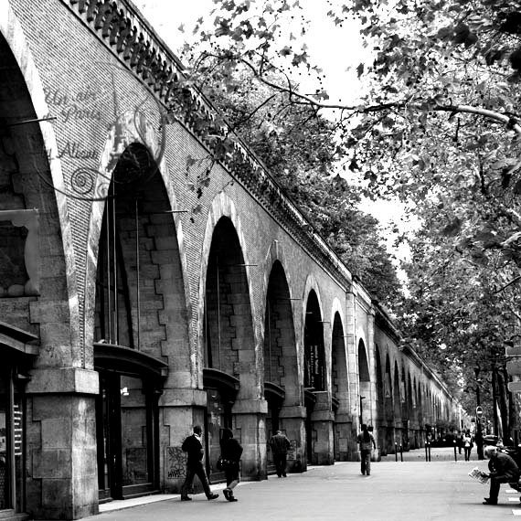
However, there actually are grays to be found here in Arizona, in spite of the propensity of brown. This fallen tree recently caught my eye on a hike to the Inner Basin in Flagstaff, and I realized that I love to use this driftwood type of color for furniture finishes and wood flooring! This is the way designers get inspiration – just by keeping our eyes open.
History of gray…
The color gray used to have a bad reputation for being cold and uninviting. Think of the terminology “Battleship Gray”…not a particularly flattering name for a color. Think of depression; if it were a color it would be gray. Think gloomy weather; it’s always gray. The color of loneliness must be gray. In our society with an emphasis on youth and vitality, gray is the color we associate with old age. The less desirable parts of a city have historically been called the Concrete Jungle (gray). When someone is gravely ill, we describe their skin color as “ashen” (gray). In the late 1930’s, gray became a symbol of industrialization and war, and while the traditional gray suit was popular to signify seriousness and dependability at one time, it gradually gave way to the navy blue suit, which gave a more forward-thinking impression to the businessman who wanted to make an impression.
Gray definitely has had negative connotations! In the design world I grew up in, “gray” was usually a blue-gray, and for years I honestly thought it should only be used in Coastal communities, where expanses of water (which turns gray when the sun isn’t out) have a big impact on the coloration of the environment. It just didn’t seem to fit into other regions of the country and during the years I have practiced design based out of Colorado and Arizona, I confess to almost never using a gray color, unless in the occasional soft, silvery tone that adds glamour and femininity to a formal space.
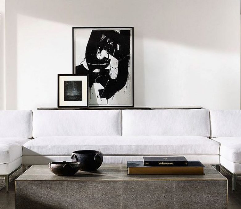
This is no longer the case, because we are embracing gray, as a general term, to include a full spectrum of colors that are just “toned down” and softer in color than their original brilliant origins. Think grayish green (sage), grayish brown (taupe), grayish white (dove gray), grayish purple (dusty lavender). By adding black to any color, the intensity of the hue is softened and made more neutral. These new grays have applications everywhere, across the board, because they are soft and pleasing, quiet and reserved. Gray’s neutrality and calmness makes it a perfect base to compliment other, more vibrant colors, giving them the background from which to “pop” and accent a room or a wardrobe.
“Industrial” as a design style, featuring gray…
As mentioned earlier in this article, gray was at one time a negative representation of things that were considered by society to be repulsive and depressing, such as war and industrialization. Speaking of industrialization and its association with the color gray, the design world has now embraced it as a singular design style. The mostly highly desirable of residential spaces in large city downtown areas for many years now has been the loft, which is the top floor of an old warehouse or business building, which typically has no dividing walls and original gray concrete floors. We have embraced the open floor plan, and the exposure of any sort of mechanical duct work or pipes, along with exceptionally tall windows, as a style that gives opportunity for great personal expression, even being a bit of a rebellious statement vs. the conformity of small divided rooms and dropped ceilings.

Industrial as a design style was pulled to the forefront of design in furnishings by the retail store, Restoration Hardware, which at the same time took gray to an epic level in the design world. Wood tones that were previously in golden, reddish or rich brown stains turned to various shades of gray. Exterior paint and stucco colors are shades of dark gray. Metal finishes are shades of silver, pewter, charcoal and darker gray. Fabrics show up in many different variations of the natural look of (gray) linen. Flooring, whether wood, porcelain, or limestone, is most sought after in shades of gray. Pieces of factory equipment, which are now old and faded (i.e. gray), are brought into the limelight in high-end interior spaces. Metal clad airplanes (silver gray) have become inspiration for chairs and desks. Pendant lighting in multi-million dollar homes is almost exactly what industrialists used to use in their factories because it was inexpensive and efficient. Industrial design has come of age…and it has transformed the world of interior design. And furthermore…it’s primarily gray.
Selecting pleasing paint colors for your walls. Think gray-ish…
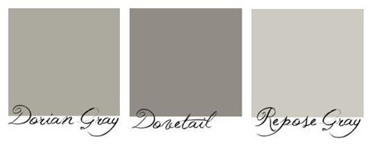
Understanding the vast array of grayed tones when you are selecting a paint color for your walls will help steer you away from the bright, clear colors that may be beautiful as a sweater, but will give your room a ghastly glow! I often come across people who tell stories of wanting aqua walls, or soft blue walls, or buttercup yellow walls….and because they are not knowledgeable in selecting a paint color for hundreds of square feet of walls based on seeing a color on a small piece of paper, they approach the color selection in a literal way. In other words, they see a color they really like on the paint deck, one that fits the description of what they think they want, and after hours of labor, or hundreds of dollars spent, they are dismayed to find that the color of their room is nothing at all like they had hoped it would be. Almost inevitably, it’s because the color they select is too clear and pure, and needs to be “grayed out” in order to come off as pleasing to the eye when it is used in such massive amounts as the walls of a room!

When I select a paint color for a person who wants “green”, for instance, I immediately go to the grayish section of the paint wheel, not the green section! Here, I will show them a color I know will be perfect, and inevitably their response is something like, “Really? It looks gray to me!”. But if you put that color that I know is green, and actually looks like gray to them, in front of a piece of white paper, it’s easy to see that it has green (blue + yellow) in it, which will of course be greatly emphasized when it covers all the walls of a room. And it will be a pleasing background color that will allow other colors in the furnishings and artwork to take center stage.

Unless you are using a paint color as an accent color on a single wall, or architectural detail, the paint color on your walls should always be a background color. It is not pleasing to walk into a room and feel accosted by the color of the walls jumping out in front of anything beautiful or interesting sitting in front of them!
How far to take it? Is gray always right?
Of course not. NOTHING is always right. The most important thing to consider when you are beginning to think about what you want your home to look like, is focusing in on what the most important elements will be that will be featured in your home. This can be literally anything, from an art collector featuring paintings and sculptures, to a person who appreciates beautiful antique area rugs building their interiors around the rugs, to people who have traveled extensively wanting to display collectibles, to collections of black & white photographs. Chances are, if you have important items you would like to display in your home, there is a color theme going on with them (or, in the case of the black & white photographs, a lack of color theme). You are drawn to a certain type of painting which is usually executed in a fairly constant color palette. You collect African masks, which are done in a range of fairly predictable colors, or you collect area rugs from a certain time period, which tend to be woven with naturally dyed wool in a blend of similar colors.
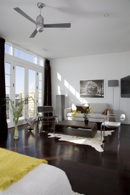
Take into consideration what these important things are, and what color palette they represent. Imagine them displayed throughout your home, and consider what kind of background will best show them off. Note I said background. The worst thing you can do is use one of the prominent colors in your collection and start painting walls to match it! Let the walls and the floors of your home set the stage for what is most important to you, not fight it. Grays, in the many shades of it, are equally appropriate as a neutral background color as white, and the many shades of white. It all depends on what compliments the environment the most. But if you are choosing a certain shade of gray for your walls (which would be very light, if creating that background we’ve been talking about!), make sure the floor is a complimentary shade of the same type of gray, to create a seamless surrounding. Limit your accents to beautiful wood tones or natural metal finishes, in addition to great lighting, in order not to detract from the important pieces you are featuring. Having mentioned the collector who collects black & white photography, this scenario presents a slightly different opportunity to use some color and/or contrast in the environment. A rich wood or natural stone floor would add to the interest of B&W photography, as long as the walls remain neutral, whether in the beige or the gray family of off-white!
Is gray trendy…?
Sure, gray is trendy. Anything that is really popular right now is trendy. Anyone who has lived long enough to remember certain color icons from the past few decades will recognize trends…from the Avocado and Harvest Gold of the 70’s, to the Mauve and Teal of the 80’s, to the Super Neutrals/Whites of the 90’s, to the Bling and Lurex of the new Millenium…. and now we love Gray. Does that mean that we never ever use a color that used to be a trend “back in the day” again? No, but it may be a slightly different variation of that color. That old Avocado might now be a soft moss green. The 80’s Mauve has arisen again, but as a sexy dusty pink.

I used to be afraid of trends, and actually worked pretty diligently to help my clients avoid them at all costs. Actually, I still do. But I acknowledge that you are not alive and well and living in the current world if you are not aware of, and influenced by, trends. It’s pretty obvious when you see a trend that is meaningless and fleeting, and has no business showing up in your interior design! The color gray is not one of those things. The colors we like are typically trendy because they represent a feeling we are having collectively as a society, which is coming from a deeply-rooted consciousness that we are all a part of. It used to be a national consciousness; now it is a global consciousness. Maybe gray is fashionable now because it represents conservative, safe, non-threatening feelings. The world is not a “safe” place anymore, if it ever was. People subconsciously seek ways to surround themselves with the feelings, values and interests they hold most dear, and the many shades of gray may represent just the very thing that meets that criteria. Go for gray, if it feels good!