As an interior designer, I’ve seen it all when it comes to good and bad design over the years. What often starts off as a design trend to follow can easily turn into a “mistake” over time. Believe me, there are a lot more than 5 mistakes you can make when designing your home! But let’s just concentrate on these five, because they are worth thinking about, and we’ll find five more for another time. All of us have made these design mistakes at one time or another; I’m sure of it!
1. Falling in love with something and buying it… and everything that “matches” it! The look of a sophisticated room, regardless of your personal style, is the look of a casual collection. If you fall in love with a wonderful piece, whether it’s a table or a headboard or a sideboard, let that piece be the center of attention in that space and build your room around it with pieces that compliment it, but in other finishes and design styles. If your bed matches your nightstand, which matches your dresser, which matches your chest…there is no one thing that is the Star!
2. Lighting a room exclusively with overhead recessed lighting. This is the subject of a whole blog, if not a book….but for now, remember never to rely on lighting in a room from just one source, particularly lighting that comes from the ceiling and shines straight down. It is the most unflattering light for the face! Light needs to fill a room from at least 3 sources: Shining down from the ceiling (primarily for traffic patterns and table tops), angled from adjustable recessed cans in the ceiling (for artwork), and from sources such as lamps and sconces that are at heights at or below the face. When 3 or more sources of light are balanced with the appropriate wattage (always on dimmers!), the feeling of a room is relaxed and balanced.
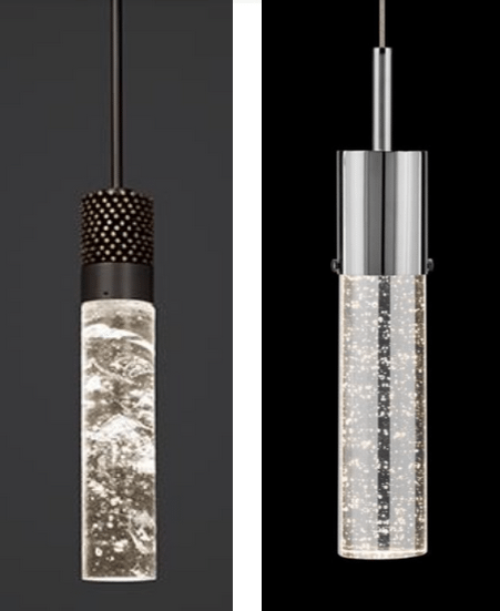
3. Purchasing online if you aren’t familiar with the quality of the company. It’s so tempting to shop in the comfort of our family rooms, but be aware that quality isn’t always visible in the couple of photos you will see on a manufacturer’s website. I recently sourced a stunning pendant light made of solid bronze and amazing hand blown glass. My client absolutely loved it (but not the price), and found something online that looked very similar (i.e. cheap knockoff). When it came in, it was worth exactly what she paid for it, which wasn’t much. Of course it was returned! As seen in the photo below, it can be very difficult to discern the difference in the real look of these two pieces in a photograph online!

MISTAKES! The solid bronze and solid blown glass pendant on the left is handmade and the craftsmanship is incredible when viewed in person. The pendant on the right looks very similar to the pricier version. But it only comes in chrome, and the glass is thin and hollow.
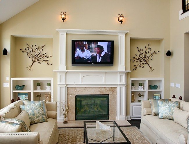
4. TV’s over fireplaces that are too high to view comfortably. We are all on board with the flat screen TV hanging on the wall now, and often in a family room, we want the TV and the fireplace to share the spotlight. However, you won’t enjoy that movie or football game if your head is tilted up for hours, trying to watch a screen that is too high! When we design rooms where the TV is intended to live above the fireplace, we try to keep the firebox low and linear, usually without a raised hearth, allowing a comfortable TV viewing angle.

MISTAKE! In this room, guests would have to tilt their heads up while watching tv due to the awkwardly high placement of the television on the wall above the fireplace.

MISTAKE! This bedspread could almost pass as a rug due to the heavy fabric and print. Opt for a lighter, more breathable fabric instead, especially when decorating for Arizona weather!
5. Bedspreads made of upholstery material. How did we ever get there…thinking that the fabric on a bed should be as heavy and durable as our sofa fabric? Regardless of the thinking, it was what we did for years. The bedding was miserably heavy to take on and off the bed and it never got washed (because it wasn’t washable!). The only good news is dirty suitcases on the bed weren’t a problem, because you couldn’t see the smudges! Keep your bedding light, washable and fresh. There are plenty of sources now for washable quilted silk and cotton coverlets that are easy to take care of!
What types of design mistakes have you made in the past? Share in the comments below!


